Primer Design System
Site navigation
On this page
Overview
Tooltips are often used to convey information. However, tooltips are rarely appropriate, and its misuse can result in a myriad of accessibility issues. Always consider not using a tooltip for an improved user experience.
Why?
- Tooltips are hidden by default making it easy to miss, so they should never be used to convey critical information.
- Tooltips are never accessible on mobile devices.
- Tooltips should never be set on non-interactive elements (for example,
div,span,p), and should only ever be set on interactive elements (for example,button,a). Tooltips on non-interactive elements are not accessible to keyboard users and screen reader users.
Guidelines
For designers
- Reserve tooltips for components like icon buttons.
- Keep your tooltip text minimal.
- Only include tooltips on other components as a last resort.
- Never include tooltips on non-interactive components (
div,span,p).

Use a tooltip to give a text label to an icon button

Don't use tooltips on non-interactive elements
Annotations
If you have an appropriate tooltip in your design, annotate the tooltip carefully with the preferred type (whether it's a label or description) to ensure proper semantics.
For developers
If you come across a design or a page with a tooltip on a static element (for example, div, span, p), remove it. Consult a designer for an alternative way of conveying the information.
If you determine that tooltips are appropriate for your use case, make sure to carefully follow guidelines set in Primer ViewComponents: Tooltip component.
Alternatives to tooltips
1. Persist the content
If possible, persist the content so it's always available rather than using a tooltip, which hides content by default. This ensures that the content is always discovered and surfaced to users regardless of device.

Find an appropriate permanent place to display additional information.

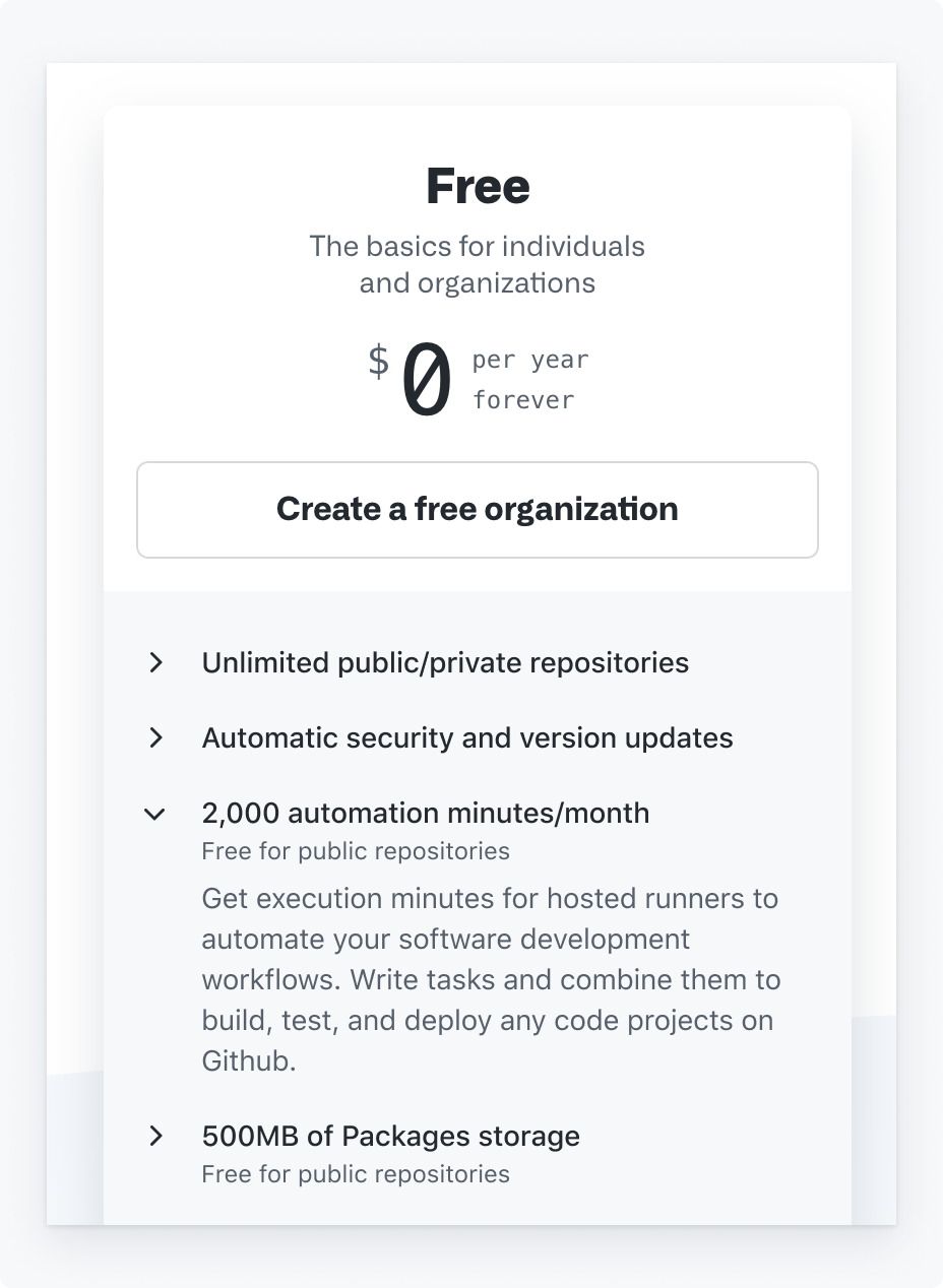
Don't use a tooltip to add additional helpful information
2. Don't duplicate content
If the tooltip duplicates content that is already available on the page, remove it.

Remove any duplicate tooltip text.

Don't set tooltips that duplicate the trigger element content.
3. Use a modal
Consider using a modal, which is accessible for mobile users and allows you to structure content that may otherwise be crammed into a tooltip.

Do use a pattern that is accessible to a larger number of users such as a modal

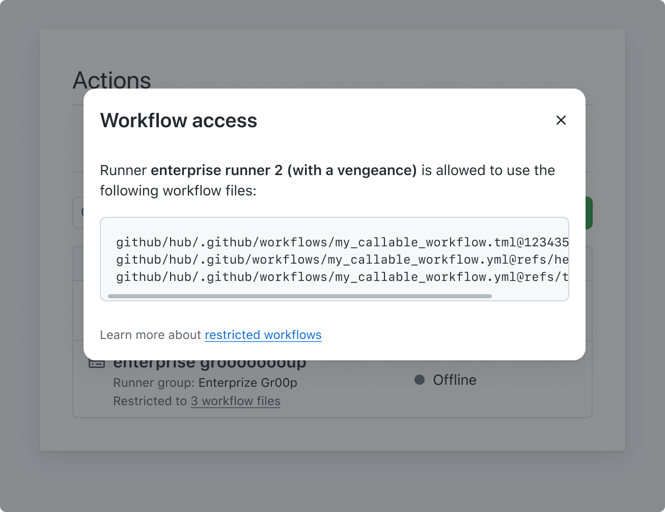
Don't place long content inside a tooltip
4. Use a summary disclosure
Consider using a summary disclosure that is accessible for mobile users and also offers the ability to show or hide content.

Do use a pattern that is accessible to a larger number of users such as a summary disclosure

Don't use tooltips on non-interactive elements
Other
If you are unsure which alternative is more suited to your scenario and need help, consult a designer or the GitHub Accessibility team (if you are GitHub staff) for advice.