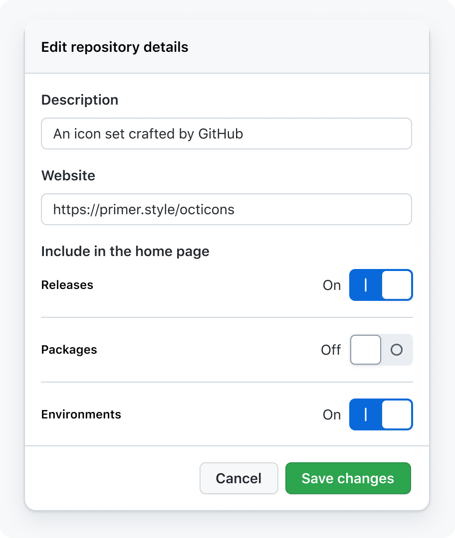
Toggle switch
Toggle switch is used to immediately toggle a setting on or off.
On this page
On this page
Anatomy

- Track: The clickable area where the toggle switch moves back and forth
- Knob: Changes color and position depending on whether the switch is on or off
- Status: A text label showing whether the switch is on or off
Options
Label and description
Every toggle switch should have a label that says what is being turned on or off. Optionally, you may include a description about the setting that is being turned on or off.
Labels should be succinct, and can describe an object or an action (for example: "Discussions" or "Automatically watch repositories"). Don't use phrases that describe the switch's state in your label.


Use succinct phrases with verbs or nouns

Don't use phrases that describe the switch's state
Layout
By default, lay out a toggle switch horizontally justified with its label and optional description.
You may use a vertical layout when a toggle switch is layed out inline with other content, or if a horizontal layout would put the switch too far from its label. If the vertical layout is left-aligned, the "on"/"off" text may be moved to the right of the switch.


Size
A small variant is provided to maintain visual hierarchy, or for dense areas where the default size will not fit.

Loading
When a toggle switch is waiting for something to load before toggling, a loading indicator should be displayed. The switch should not prematurely toggle from "on" to "off". Wait until loading is complete before showing a change.

Progressive disclosure
The progressive disclosure pattern may be used to hide or show content based on whether a toggle switch is on. Content revealed on toggle switch activation should always come after the toggle switch.

Accessibility
Keyboard navigation
Toggle switches should have the same keyboard navigation features as a button. A toggle switch may be focused using the Tab key, and pressing the Enter or Space key will toggle the switch.
Touch target
When the UI is rendered on a touch-screen device, ensure that the toggle switch has a large enough touch target size. The toggle switch should respond to hovers, clicks, and taps anywhere in the touch target area, even if it isn't directly on the control.

Mixed values
Since a toggle switch can only be "on" or "off", it could be confusing to use a switch to represent mixed values.
If you have a group of configuration options that can be disabled, use a button instead of a toggle switch. Disabling the group turns off all configuration options, but remembers their previous state when the user wants to turn that section back on. While the section is disabled, the configuration options are hidden.


Use a button to affect multiple related toggles

Don't use a toggle switch to represent mixed values
Toggle switch vs checkbox
Toggle switches are buttons that change and save a boolean configuration option when they are toggled. Checkboxes are form inputs that are used to select one or more items from a list, and are not saved without explicit confirmation such as pressing a Save button.
A toggle switch should never be used as a replacement for a checkbox. See saving patterns for more details.

Use a toggle switch like a button

Don't use a toggle switch as a replacement for a checkbox